Material Design Lite is a light-weight implementation of Material Design, specifically crafted for the web. For more detailed guidelines and specifications for other platforms please refer to the Material Design site
Typography
- h1
-
Light 112spdisplay-4 font weight 300
- h2
-
Regular 56spdisplay-3 font weight 400
- h3
-
Regular 45spdisplay-2 font weight 400
- h4
-
Regular 34spdisplay-1 font weight 400
- h5
-
Regular 24spheadline font weight 400
- h6
-
Regular 20sptitle font weight 500
<head> of your HTML document.
<link rel="stylesheet" href="http://fonts.googleapis.com/css?family=Roboto:300,400,500,700" type="text/css">
Icons
Material Design Icons are the official open-source icons featured in the Google Material Design specification. What’s included:
- SVG versions of all icons in both 24px and 48px flavours
- SVG and CSS sprites of all icons
- 1x, 2x icons targeted at the Web (PNG)
- 1x, 2x, 3x icons targeted at iOS (PNG)
- Hi-dpi version of all icons (hdpi, mdpi, xhdpi, xxhdpi, xxxhdpi) (PNG)
Getting Started
You have a few options for getting the icons.
Download the Zip
Grab the latest stable zip archive (~57MB) of all icons of the bleeding-edge version from master.
Bower
$ bower install material-design-icons --savenpm
$ npm install material-design-icons --saveUsage
Take a look at the included index.html file for a preview of all icons included in the set. You are free to use the icons in the way that makes most sense to your project.
Structure
In general, an icon category (e.g. action) will include the following directories, containing multiple resolutions of our icons.
- 1x, 2x Web
- 1x, 2x, 3x iOS
- drawable hdpi, mdpi, xhdpi, xxhdpi, xxxhdpi
- svg
Decide on the icon resolution required for your project and copy, then reference the icons you wish to use.
Spritesheets
Material Design icons come with SVG and CSS sprites for each category of icon we include. These can be found in the sprites directory, under svg-sprite and css-sprite.
Using CSS Sprites
To use a CSS spritesheet, reference the stylesheet for the icon category you wish to use, then include the icon definition in your markup. E.g. to use one of the play icons in css-sprite-av.
That’s it! Don’t forget to publish the corresponding CSS and SVG/PNG files when deploying your project.
<link href="css-sprite/sprite-av-black.css" rel="stylesheet"><div></div>icon spritesheet and specific icon icon-ic_play-circle_outline_black_24dp, which you can get from the above stylesheet.
<div class="icon icon-ic_play-circle_outline_black_24dp"></div>Using SVG Sprites
Similarly, to use an SVG spritesheet, reference the stylesheet for the icon category, then include the icon definition in your markup.
svg-sprite-av, reference the stylesheet:
<link href="svg-sprite/svg-sprite-av.css" rel="stylesheet"><div></div><style>
.svg-ic_play_circle_outline_24px-dims { width: 24px; height: 24px; }
</style>svg-ic_play_circle_outline_24px, which you can get from the above stylesheet.
<div class="svg-ic_play_circle_outline_24px svg-ic_play_circle_outline_24px-dims"> </div>Polymer Icons
If you wish to use the icon set with Polymer, we recommend consuming them via the <iron-icons>-element.
License
All icons are released under Attribution 4.0 International license.

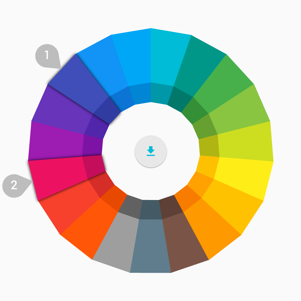
Color palette
If you’re using the extended color palette, use the first color as the primary color in your app and the other colors as accents.
See all colors and their accessibility ratios. This resource includes info on the appropriate contrast ratios and alpha values when using white or black text on a colored background.